You can download the datasets and R code file for this session here.
Contents
- Taking a random sample from data
- Descriptive statistics
- Central Tendency
- Variance
- Quartiles, Percentiles
- Box Plots
- Graphs
Sampling in R
- We need to use sample() function
Sample_set <- dataset[sample(1:nrow(mydata), n), ]Retail_data <- read.csv("~\\Online Retail Sales Data\\Online Retail.csv")
dim(Retail_data)## [1] 541909 8- Sample size 10000
Sample_set <- Retail_data[sample(1:nrow(Retail_data),10000), ]
dim(Sample_set)
## [1] 10000 8LAB: Sampling in R
-
- Import “Census Income Data/Income_data.csv”
-
- Create a new dataset by taking a random sample of 5000 records
Income_data<- read.csv("~\\Census Income Data\\Income_data.csv")
sample <- Income_data[sample(1:nrow(Income_data),5000),]
dim(sample)
## [1] 5000 15Descriptive Statistics
- The basic descriptive statistics to give us an idea on the variables and their distributions
- Permit the analyst to describe many pieces of data with a few indices
- Central tendencies
- Mean
- Median
- Dispersion
- Range
- Variance
- Standard deviation
Central tendencies
Mean
- The arithmetic mean
- Sum of values/ Count of values
- Gives a quick idea on average of a variable
Median
- Mean is not a good measure in presence of outliers
- For example Consider below data vector 1.5,1.7,1.9,0.8,0.8,1.2,1.9,1.4, 9 , 0.7 , 1.1
- 90% of the above values are less than 2, but the mean of above vector is 2
- There is an unusual value in the above data vector i.e 9
- It is also known as outlier.
- Mean is not the true middle value in presence of outliers. Mean is very much effected by the outliers.
- We use median, the true middle value in such cases
- Sort the data either in ascending or descending order
| Vector | Sorted Ventor |
|---|---|
| 1.5 | 0.7 |
| 1.7 | 0.8 |
| 1.9 | 0.8 |
| 0.8 | 1.1 |
| 0.8 | 1.2 |
| 1.2 | 1.4 |
| 1.9 | 1.5 |
| 1.4 | 1.7 |
| 9 | 1.9 |
| 0.7 | 1.9 |
| 1.1 | 9 |
- Mean of the data is 2
- Median of the data is 1.4
- Even if we have the outlier as 90, we will have the same median
- Median is a positional measure, it doesn’t really depend on outliers
- When there are no outliers then mean and median will be nearly equal
- When mean is not equal to median it gives us an idea on presence of outliers in the data
Mean and Median on R
Income  <- read.csv("~\\Census Income DataIncome_data.csv")

mean(Income$capital.gain)
## [1] 1077.649median(Income$capital.gain)## [1] 0Mean is far away from median. Looks like there are outliers, we need to look at percentiles and box plot.
LAB: Mean and Median on R
-
- Import Dataset: “./Online Retail Sales Data/Online Retail.csv”
-
- What is the mean of “UnitPrice”
-
- What is the median of “UnitPrice”
-
- Is mean equal to median? Do you suspect the presence of outliers in the data?
-
- What is the mean of “Quantity”
-
- What is the median of “Quantity”
-
- Is mean equal to median? Do you suspect the presence of outliers in the data?
Solutions
-
- Import Dataset: “./Online Retail Sales Data/Online Retail.csv”
Online_Retail<-read.csv("~\\Online Retail Sales Data\\Online Retail.csv")-
- What is the mean of “UnitPrice”
mean(Online_Retail$UnitPrice)## [1] 4.611114-
- What is the median of “UnitPrice”
median(Online_Retail$UnitPrice)## [1] 2.08- 4.Is mean equal to median? Do you suspect the presence of outliers in the data?Yes, in this case mean and median are close. However we still cannot conclude on the absence of outlier because if there are balancing outliers on the either side of median, then also the mean and median can be close.
-
- What is the mean of “Quantity”
mean(Online_Retail$Quantity)## [1] 9.55225-
- What is the median of “Quantity”
median(Online_Retail$Quantity)## [1] 3- 7.Is mean equal to median? Do you suspect the presence of outliers in the data?No.Looks like there are outliers.
Dispersion
- Just knowing the central tendency is not enough.
- Two variables might have same mean, but they might be very different.
- Dispersion gives us an idea about the spread of the data.
- Look at these two variables. Profit details of two companies A & B for last 14 Quarters in MMs
| Mean | |||||||||||||||
| Company A | 43 | 44 | 0 | 25 | 20 | 35 | -8 | 13 | -10 | -8 | 32 | 11 | -8 | 21 | 15 |
| Company B | 17 | 15 | 12 | 17 | 15 | 18 | 12 | 15 | 12 | 13 | 18 | 18 | 14 | 14 | 15 |
- Though the average profit is 15 in both the cases
- Company B has performed consistently than company A.
- There was even loses for company A
- Measures of dispersion become very vital in such cases
Variance and Standard Deviation
- Dispersion is the quantification of deviation of each point from the mean value.
- Variance is average of squared distances of each point from the mean
- Variance is a fairly good measure of dispersion.
- Variance in profit for company A is 352 and Company B is 4.9
Variance Calculation
| Value | Value-Mean | (Value-Mean)^2 |
| 43 | 28 | 784 |
| 44 | 29 | 841 |
| 0 | -15 | 225 |
| 25 | 10 | 100 |
| 20 | 5 | 25 |
| 35 | 20 | 400 |
| -8 | -23 | 529 |
| 13 | -2 | 4 |
| -10 | -25 | 625 |
| -8 | -23 | 529 |
| 32 | 17 | 289 |
| 11 | -4 | 16 |
| -8 | -23 | 529 |
| 21 | 6 | 36 |
| 15.0 | 352 |
| Value | Value-Mean | (Value-Mean)^2 |
| 17 | 2 | 4 |
| 15 | 0 | 0 |
| 12 | -3 | 9 |
| 17 | 2 | 4 |
| 15 | 0 | 0 |
| 18 | 3 | 9 |
| 12 | -3 | 9 |
| 15 | 0 | 0 |
| 12 | -3 | 9 |
| 13 | -2 | 4 |
| 18 | 3 | 9 |
| 18 | 3 | 9 |
| 14 | -1 | 1 |
| 14 | -1 | 1 |
| 15.0 | 4.9 |
Standard Deviation
- Standard deviation is just the square root of variance
- Variance gives a good idea on dispersion, but it is of the order of squares.
- Its very clear from the formula, variance unites are squared than that of original data.
- Standard deviation is the variance measure that is in the same units as the original data
Variance and Standard Deviation in R
- Divide the Income data into two sets. USA vs Others
usa_income<-Income[(Income$native.country==" United-States"), ]
other_income<-Income[!(Income$native.country==" United-States"),]
nrow(usa_income)
## [1] 29170nrow(other_income)## [1] 3391- Find the variance of “education.num” in those two sets. Which one has higher variance?
- Variance and SD for USA
var(usa_income$education.num)## [1] 5.735863sd(usa_income$education.num)## [1] 2.394966- Variance and SD for Other
var(other_income$education.num)## [1] 13.56761sd(other_income$education.num)## [1] 3.683424other_income dataset has a higher variance
LAB: Variance and Standard deviation
-
- Import Dataset: “./Online Retail Sales Data/Online Retail.csv”
-
- What is the variance and s.d of “UnitPrice”
-
- What is the variance and s.d of “Quantity”
-
- Which one these two variables is consistent?
Online_Retail<-read.csv("~\\Online Retail Sales Data\\Online Retail.csv")Solutions
-
- What is the variance and standard dediation of “UnitPrice”
var(Online_Retail$UnitPrice)## [1] 9362.469sd(Online_Retail$UnitPrice)## [1] 96.75985-
- What is the variance and s.d of “Quantity”
var(Online_Retail$Quantity)## [1] 47559.39sd(Online_Retail$Quantity)## [1] 218.0812- 4.Which one these two variables is consistent?UnitPrice
Percentiles
- A student attended an exam along with 1000 others.
- He got 68% marks? How good or bad he performed in the exam?
- What will be his rank overall?
- What will be his rank if there were 100 students overall?
- For example, with 68 marks, he stood at 90th position. There are 910 students who got less than 68, only 89 students got more marks than him
- He is standing at 91 percentile.
- Instead of stating 68 marks, 91% gives a good idea on his performance
- Percentiles make the data easy to read
- (p^{th}) percentile: p percent of observations below it, (100 – p)% above it.
- Marks are 40 but percentile is 80%, what does this mean?
- 80% of CAT exam percentile means
- 20% are above & 80% are below
- Percentiles help us in getting an idea on outliers.
- For example the highest income value is 400,000 but 95th percentile is 20,000 only. That means 95% of the values are less than 20,000. So the values near 400,000 are clearly outliers
Quartiles
- Percentiles divide the whole population into 100 groups where as quartiles divide the population into 4 groups
- p = 25: First Quartile or Lower quartile (LQ)
- p = 50: second quartile or Median
- p = 75: Third Quartile or Upper quartile (UQ)
Percentiles & Quartiles in R
- By default summary gives 4 quartiles
summary(Income$capital.gain)## Min. 1st Qu. Median Mean 3rd Qu. Max.
## 0 0 0 1078 0 100000quantile(Income$capital.gain, c(0, 0.1, 0.2, 0.3, 0.4, 0.5, 0.6, 0.7, 0.8, 0.9, 1)) ## 0% 10% 20% 30% 40% 50% 60% 70% 80% 90% 100%
## 0 0 0 0 0 0 0 0 0 0 99999quantile(Income$capital.loss, c(0, 0.1, 0.2, 0.3, 0.4, 0.5, 0.6, 0.7, 0.8, 0.9, 1)) ## 0% 10% 20% 30% 40% 50% 60% 70% 80% 90% 100%
## 0 0 0 0 0 0 0 0 0 0 4356quantile(Income$hours.per.week, c(0, 0.1, 0.2, 0.3, 0.4, 0.5, 0.6, 0.7, 0.8, 0.9, 1)) ## 0% 10% 20% 30% 40% 50% 60% 70% 80% 90% 100%
## 1 24 35 40 40 40 40 40 48 55 99Looks like some people are working 90 hours perweek.
LAB: Percentiles & Quartiles in R
-
- ImportDataset: “./Bank Marketing/bank_market.csv”
-
- Get the summary of the balance variable
-
- Do you suspect any outliers in balance ?
-
- Get relevant percentiles and see their distribution.
-
- Are there really some outliers present?
-
- Get the summary of the age variable
-
- Do you suspect any outliers in age?
-
- Get relevant percentiles and see their distribution.
-
- Are there really some outliers present?
Solutions
-
- ImportDataset: “./Bank Marketing/bank_market.csv”
bank_market <- read.csv("~\\Bank Marketing\\bank_market.csv")-
- Get the summary of the balance variable
summary(bank_market$balance)## Min. 1st Qu. Median Mean 3rd Qu. Max.
## -8019 72 448 1362 1428 102100- 3.Do you suspect any outliers in balance ?
Yes
-
- Get relevant percentiles and see their distribution.
quantile(bank_market$balance, c(0, 0.1, 0.2, 0.3, 0.4, 0.5, 0.6, 0.7, 0.8, 0.9, 1)) ## 0% 10% 20% 30% 40% 50% 60% 70% 80% 90%
## -8019 0 22 131 272 448 701 1126 1859 3574
## 100%
## 102127- 5.Are there really some outliers present?
Yes
-
- Get the summary of the age variable
summary(bank_market$age)## Min. 1st Qu. Median Mean 3rd Qu. Max.
## 18.00 33.00 39.00 40.94 48.00 95.00- 7.Do you suspect any outliers in age?
No
-
- Get relevant percentiles and see their distribution.
quantile(bank_market$age, c(0, 0.1, 0.2, 0.3, 0.4, 0.5, 0.6, 0.7, 0.8, 0.9, 1)) ## 0% 10% 20% 30% 40% 50% 60% 70% 80% 90% 100%
## 18 29 32 34 36 39 42 46 51 56 95- 9.Are there really some outliers present?
Yes
Box Plots and Outlier Detection
- Box plots have box from LQ to UQ, with median marked.
- They portray a five-number graphical summary of the data Minimum, LQ, Median, UQ, Maximum
- Helps us to get an idea on the data distribution
- Helps us to identify the outliers easily
- 25% of the population is below first quartile,
- 75% of the population is below third quartile
- If the box is pushed to one side and some values are far away from the box then it’s a clear indication of outliers
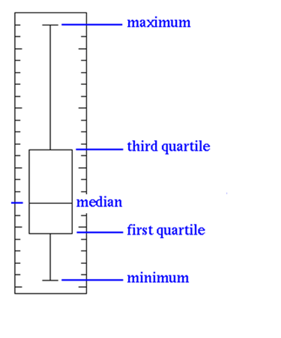
- Some set of values far away from box, is gives us a clear indication of outliers.
- In this example the minimum is 5, maximum is 120, and 75% of the values are less than 15
- Still there are some records reaching 120. Hence a clear indication of outliers

- Sometimes the outliers are so evident that, the box appear to be a horizontal line in box plot.
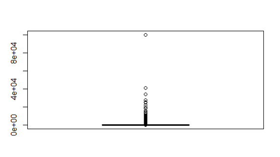
Box plots and Outlier Detection on R
boxplot(usa_income$capital.gain)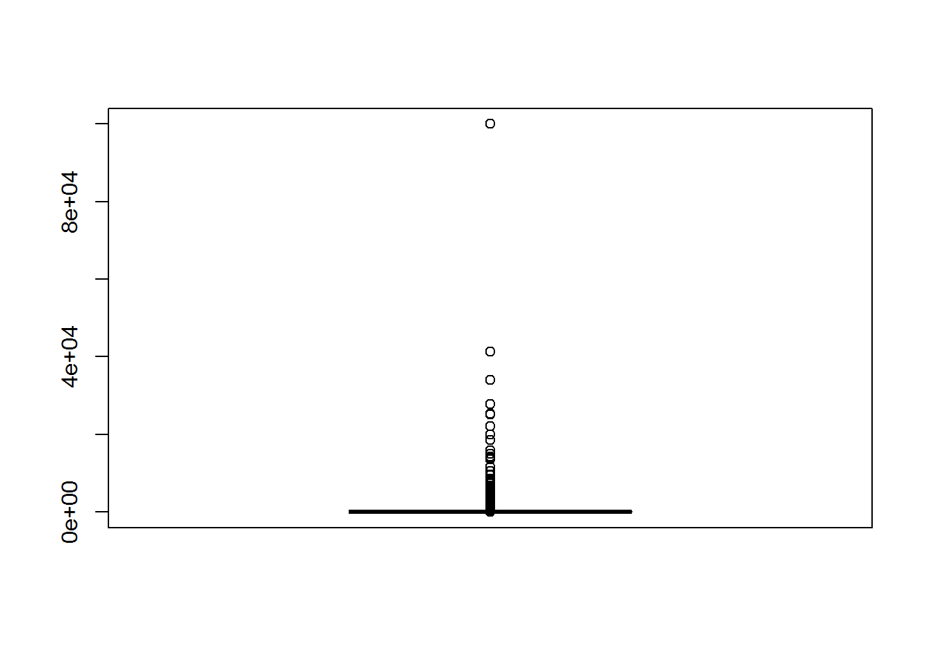
boxplot(usa_income$education.num)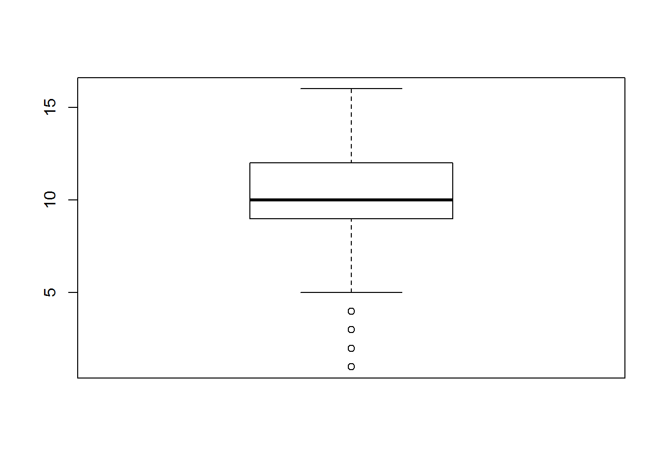
LAB: Box plots and outlier detection
-
- Import Dataset: “./Bank Marketing/bank_market.csv”
-
- Draw a box plot for balance variable
-
- Do you suspect any outliers in balance ?
-
- Get relevant percentiles and see their distribution.
-
- Draw a box plot for age variable
-
- Do you suspect any outliers in age?
-
- Get relevant percentiles and see their distribution.
Solutions
-
- Import Dataset: “./Bank Marketing/bank_market.csv”
bank_market <- read.csv("~\\Bank Marketing\\bank_market.csv")-
- Draw a box plot for balance variable
boxplot(bank_market$balance) – 3.Do you suspect any outliers in balance ? Yes – 4.Get relevant percentiles and see their distribution.
quantile(bank_market$balance, c(0, 0.1, 0.2, 0.3, 0.4, 0.5, 0.6, 0.7, 0.8, 0.9, 1)) ## 0% 10% 20% 30% 40% 50% 60% 70% 80% 90%
## -8019 0 22 131 272 448 701 1126 1859 3574
## 100%
## 102127-
- Draw a box plot for age variable
boxplot(bank_market$age)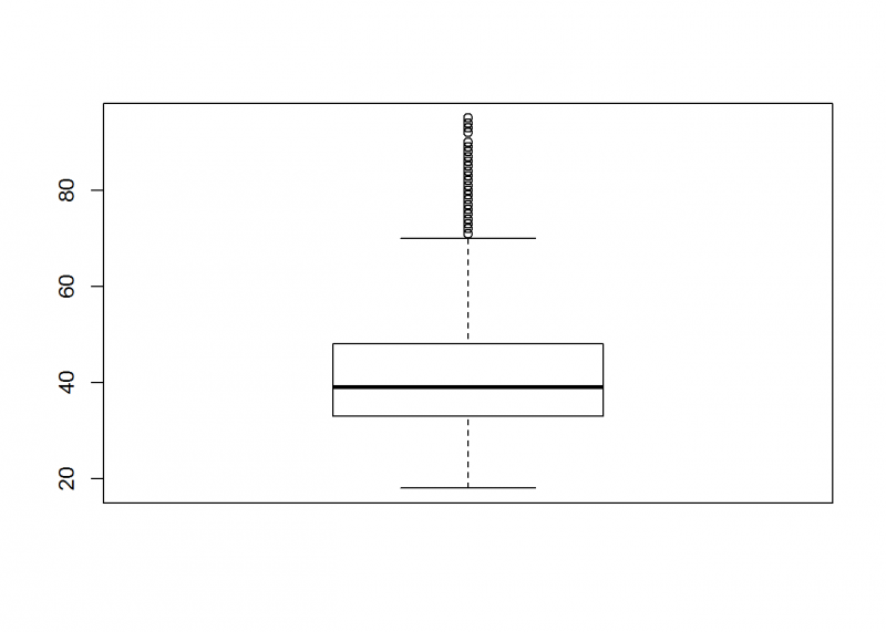
6.Do you suspect any outliers in balance ? Yes – 7.Get relevant percentiles and see their distribution.
quantile(bank_market$age, c(0, 0.1, 0.2, 0.3, 0.4, 0.5, 0.6, 0.7, 0.8, 0.9, 1)) ## 0% 10% 20% 30% 40% 50% 60% 70% 80% 90% 100%
## 18 29 32 34 36 39 42 46 51 56 95Creating Graphs
- Scatter Plot:
- Scatter plots give us an indication on the relation between the two chosen variables.
- Example:
data()
cars
scatter(cars$speed, cars$dist)
plot(cars$speed, cars$dist)
LAB: Graphs
-
- Import Dataset: “./Sporting_goods_sales/Sporting_goods_sales.csv”
-
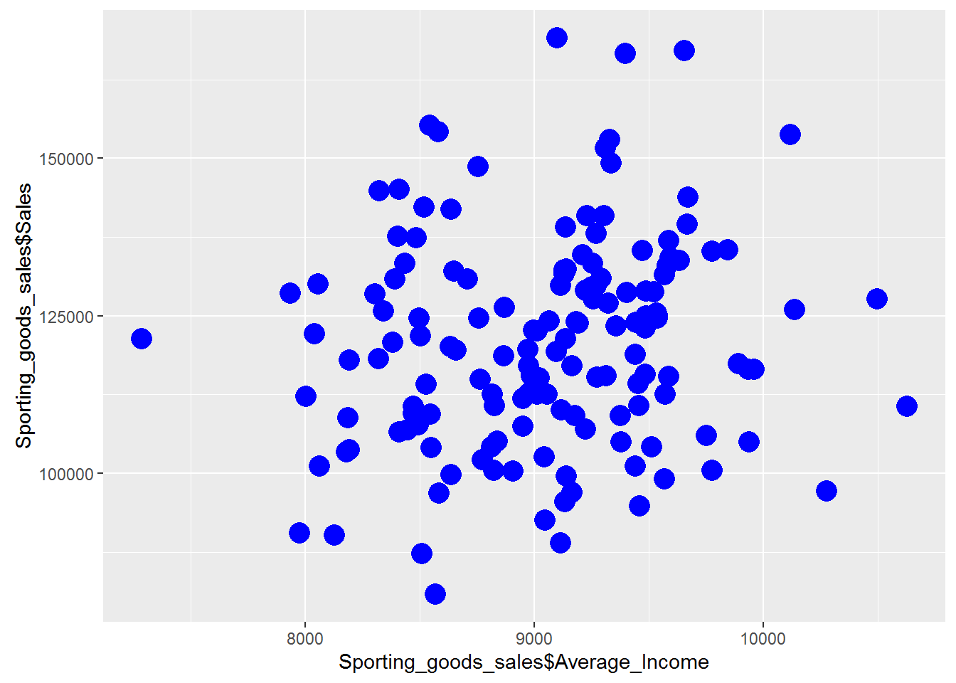
- Draw a scatter plot between Average_Income and Sales. Is there any relation between two variables?
-
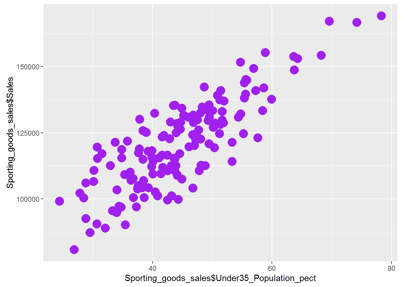
- Draw a scatter plot between Under35_Population_pect and Sales. Is there any relation between two?
Solutions
-
- Import Dataset: “./Sporting_goods_sales/Sporting_goods_sales.csv”
Sporting_goods_sales <- read.csv("~\\Sporting_goods_sales\\Sporting_goods_sales.csv")-
- Draw a scatter plot between Average_Income and Sales. Is there any relation between two variables?
plot(Sporting_goods_sales$Average_Income, Sporting_goods_sales$Sales)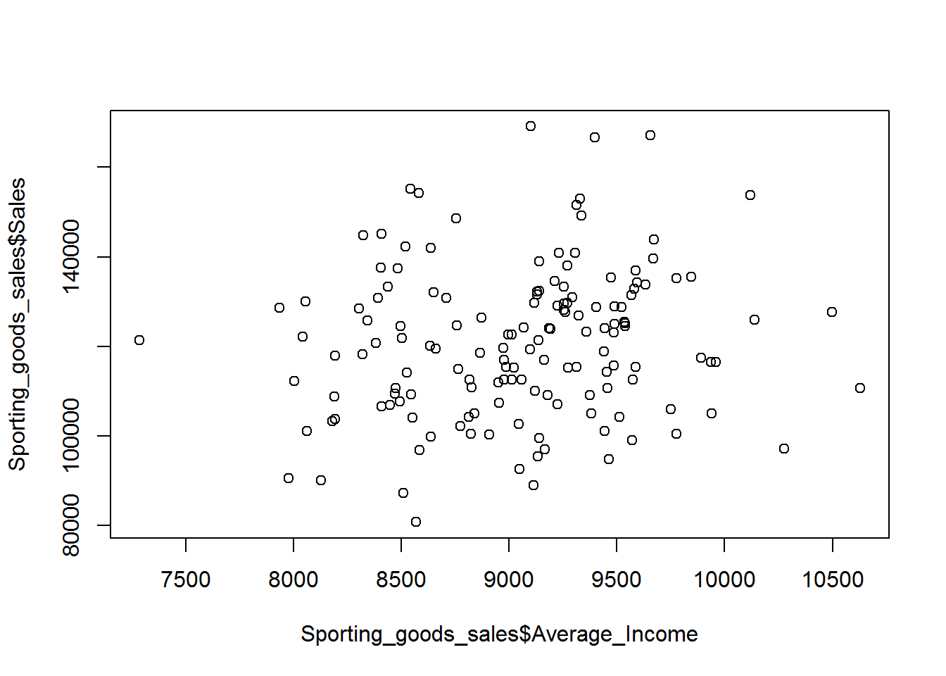 Looks like there is as such no relation between Average_Income and Sales.
-
- Draw a scatter plot between Under35_Population_pect and Sales. Is there any relation between two?
plot(Sporting_goods_sales$Under35_Population_pect, Sporting_goods_sales$Sales)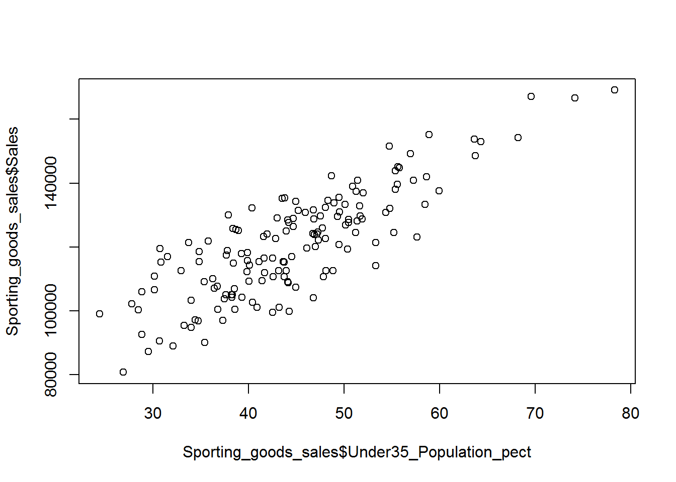 There is a strong positive relationship between Under35_Population_pect and Sales.
Bar Chart
bar_table<-table(mtcars$cyl)
barplot(bar_table, main="Cars Data Details",   xlab="Cylinders", ylab="Cars Count")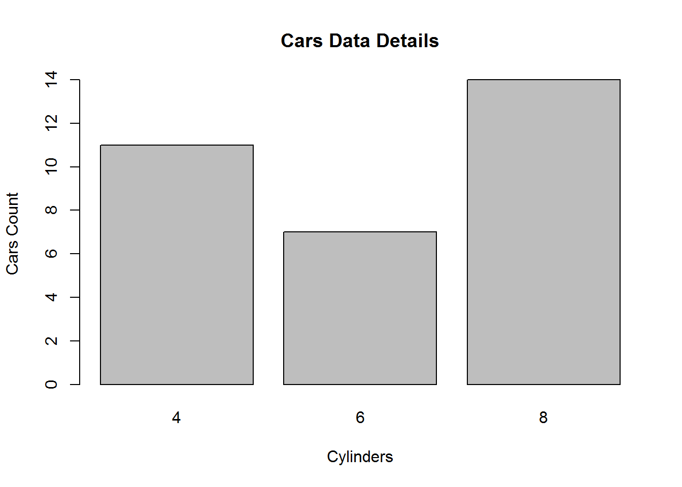
bar_table_gear<-table(mtcars$gear)
barplot(bar_table_gear, main="Cars Data Details",   xlab="gears", ylab="Cars Count" , col = 4)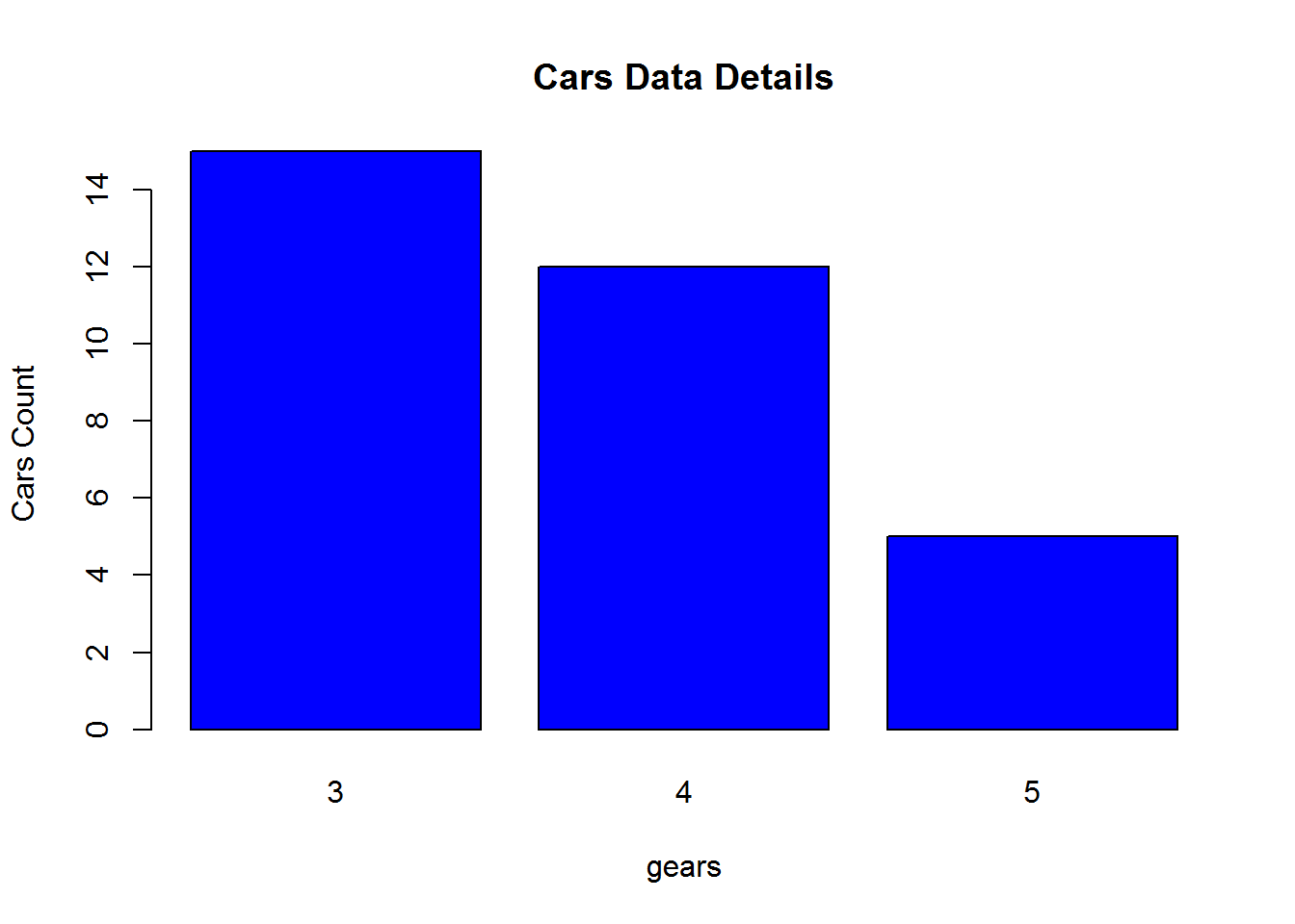
LAB: Bar Chart
-
- Import Dataset: “./Sporting_goods_sales/Sporting_goods_sales.csv”
-
- Create a bar chart summarizing the information on family size.
Solutions
Sporting_goods_sales <- read.csv("~\\Sporting_goods_sales\\Sporting_goods_sales.csv")-
- Create a bar chart summarizing the information on family size.
table_family.size<-table(Sporting_goods_sales$Avg_family_size)
barplot(table_family.size, main="Family Size Details",   xlab="Avg_family_size", ylab="Count" , col = 4)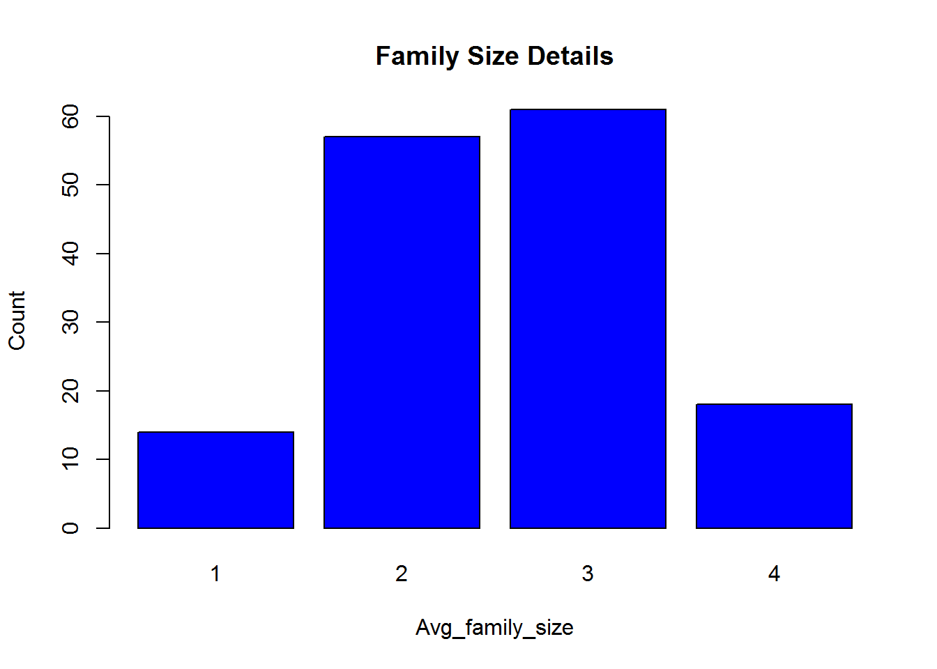
Trend chart – Trend chart is used for time series datasets.
plot(AirPassengers)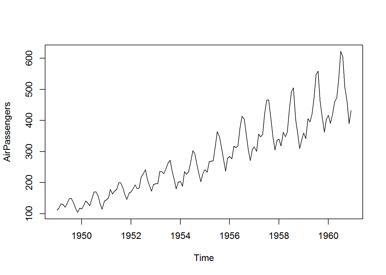
Lab : Trend chart
-
- Draw trend chart for Ukgas data from datasets package
-
- Plot JohnsonJohnson data in a trend chart
Solutions
-
- Draw trend chart for Ukgas data from datasets package
plot(UKgas)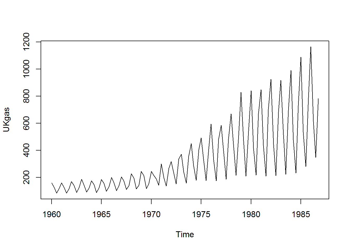 – 2. Plot JohnsonJohnson data in a trend chart
plot(JohnsonJohnson)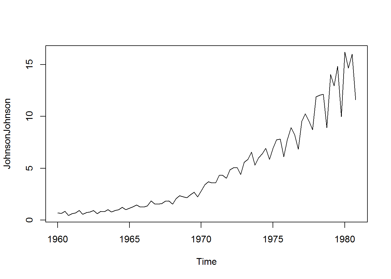
ggplot for Better Charts
- ggplot is a good plotting library. It has lot of options to make our graphs look pretty
- Cars data used in scatter plot
library(ggplot2)## Warning: package 'ggplot2' was built under R version 3.1.3qplot(speed, dist, data=cars, colour = I("red"), size=I(5))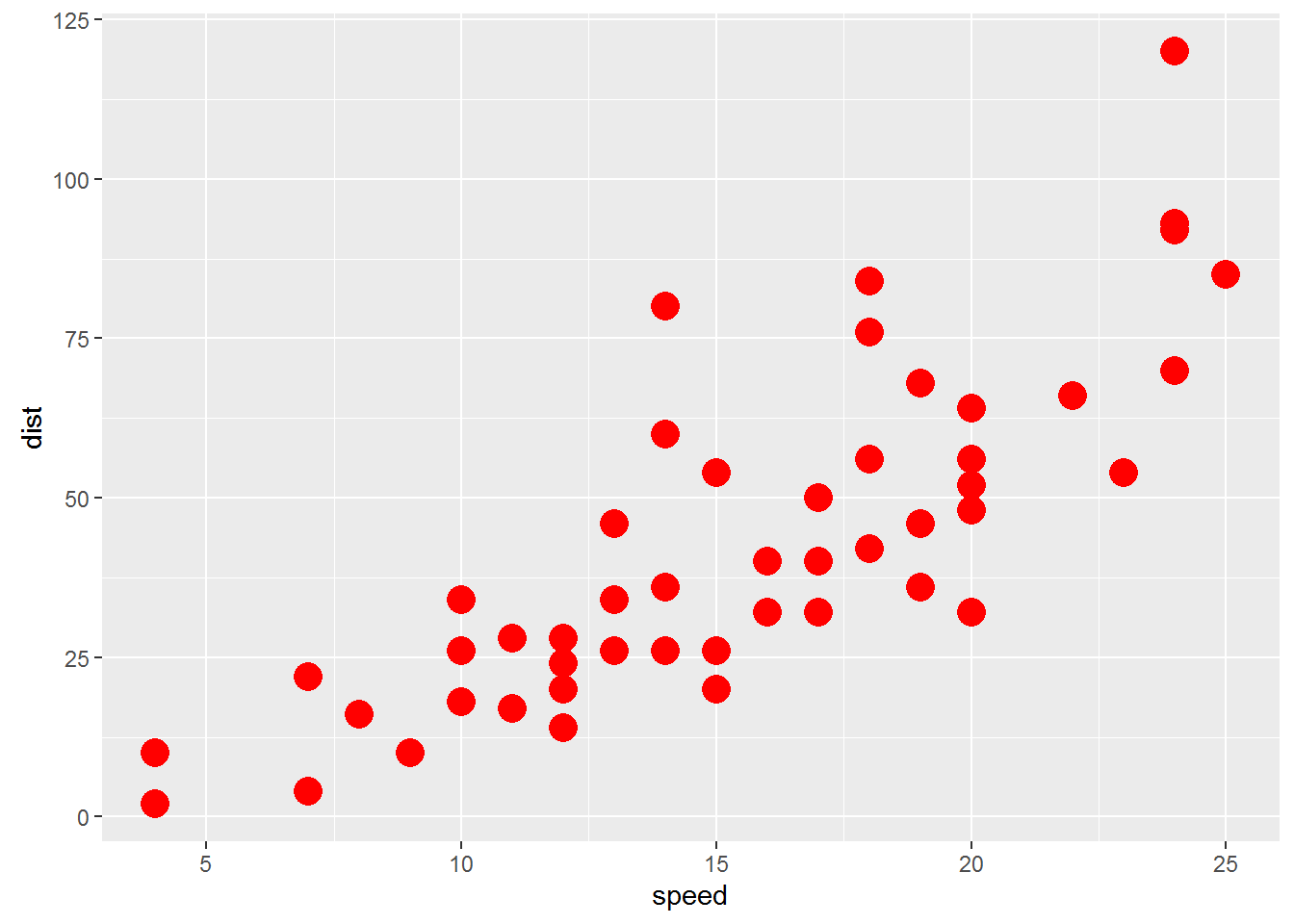
- Scatter plot between Average_Income and Sales
- Scatter plot between Under35_Population_pect and Sales
Conclusion
- In this session we discussed some basic data reporting and graph
- Studying descriptive statistics is essential before we start our advanced modeling. It gives us an idea on variable distribution
- We also discussed drawing graphs using some useful packages in R
- There are some good visualization packages in R, like ggplot and R-shiny. You can make use of them for story-telling and visualizations.