Introduction
Here we will try to cover basic statistics, graphs and reports. So far, we have covered basic python programming and basic data handling. In this session we will cover the basic statistics. The statistical concepts are very important to learn before we get into real analytics. Once we have imported our datasets, performing some basic statistics will give us the idea of what the parameters are, what the variables do, how they are working, how they are distributed, etc. Understanding this will give us a basic idea of the data that we have imported.
Contents
- Taking a random sample from data
- Descriptive statistics
- Central Tendency
- Variance
- Quartiles, Percentiles
- Box Plots
- Graphs
Sampling in Python
Sampling is a method to select few observations from a large population or a large dataset, in a way that all the underlying characteristics can be represented with the sample that we already taken. Basically, it is nothing but a subset of a large dataset and each value in the subset is taken randomly. Now if we want to obtain the result from the whole dataset, a similar result can be obtained from the sample dataset. This is the advantage of sampling. We will now see how to perform sampling in python. In order to import any data we need to use pandas package. For sampling we need to use sample() function for sampling the data. The code for sampling the data is as follows:
#Taking a random sample

import pandas as pd
Online_Retail=pd.read_csv("C:UsersADMINDocumentsPython ScriptsPy ProgrammingSession 1DatasetsOnline_Retail_Sales_DataOnline Retail.csv", encoding = "ISO-8859-1")
Online_Retail.shape
sample_data=Online_Retail.sample(n=1000,replace="False")
sample_data.shape
LAB: Sampling in Python
- Import “Census Income Data/Income_data.csv”
- Create a new dataset by taking a random sample of 5000 records
#Import “Census Income Data/Income_data.csv”
Income=pd.read_csv("C:UsersADMINDocumentsPython ScriptsPy ProgrammingSession 1DatasetsCensus Income DataIncome_data.csv")
Income.shape
Income.head()
Income.tail(3)
 #Sample size 5000
Sample_income=Income.sample(n=5000)
Sample_income.shape
Sample_income
Descriptive statistics:
- The basic descriptive statistics give us an idea about the variables and their distributions.
- Permit the analyst to describe many pieces of data with few indices.
- Central tendencies
- Central tendencies are the middle values of the data frame or any variable.These are of two types.
- Mean
- Median
- Dispersion
- Dispersion just shows the range or stretch of that variable.
- Range
- Variance
- Standard deviation
Mean
- The arithmetic mean
- Sum of values/ Count of values
- Gives a quick idea on average of a variable
Median
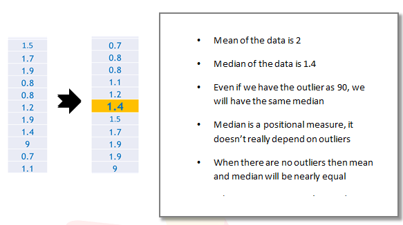
- Mean is not a good measure in presence of outliers
- For example Consider below data vector
- 1.5,1.7,1.9,0.8,0.8,1.2,1.9,1.4, 9 , 0.7 , 1.1
- 90% of the above values are less than 2, but the mean of above vector is 2
- There is an unusual value in the above data vector i.e 9
- It is an outlier in the data vector.
- Mean is not the true middle value in presence of outliers. Mean is very much effected by the outliers.
- We use median, the true middle value in such cases.
- Sort the data either in ascending or descending order.
Caluclating Mean and Median in python
We have to import the income data set and we need to find the mean and median for the variable called capital-gain. In order find the mean or median of a variable, we take the whole dataset, then we use the square bracket to redirect to the column name and then we use .mean() or .median for finding mean or median respectively.
#Import “Census Income Data/Income_data.csv”
Income=pd.read_csv("C:UsersADMINDocumentsPython ScriptsPy ProgrammingSession 1DatasetsCensus Income DataIncome_data.csv")

Income.columns.values
#Mean and Median on python
gain_mean=Income["capital-gain"].mean()
gain_mean
gain_median=Income["capital-gain"].median()
gain_median
LAB: Mean and Median on Python
- Dataset: “./Online Retail Sales Data/Online Retail.csv”
- What is the mean of “UnitPrice”
- What is the median of “UnitPrice”
- Is mean equal to median? Do you suspect the presence of outliers in the data?
- What is the mean of “Quantity”
- What is the median of “Quantity”
- Is mean equal to median? Do you suspect the presence of outliers in the data?
Online_Retail=pd.read_csv("C:UsersADMINDocumentsPython ScriptsPy ProgrammingSession 1DatasetsOnline_Retail_Sales_DataOnline Retail.csv", encoding = "ISO-8859-1")
Online_Retail.shape
Online_Retail.columns.values
#Mean and median of 'UnitPrice' in Online Retail data
up_mean=Online_Retail['UnitPrice'].mean()
up_mean
up_median=Online_Retail['UnitPrice'].median()
up_median
#Mean of "Quantity" in Online Retail data
Quantity_mean=Online_Retail['Quantity'].mean()
Quantity_mean
Quantity_median=Online_Retail['Quantity'].median()
Quantity_median
Dispersion Measures: Variance and Standard Deviation:
Central tendencies are not enough to understand the variable. It only tells us about the middle values, not the degree of the range or stretch of a variable. So the measure of dispersion is necessary to understand the range of the values and the presence of outliers.
Dispersion
- Just knowing the central tendency is not enough.
- Two variables might have same mean, but they might be very different.
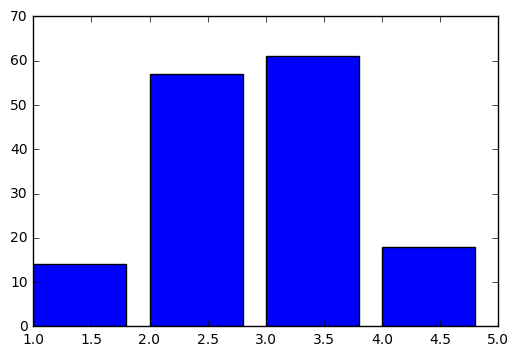
- Look at the Profit details of two companies A & B for last 14 Quarters in MMs
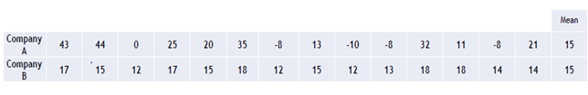
- Though the average profit is 15 in both the cases, company B has performed consistently than company A.
- There were even loses for company A.
- Measures of dispersion become very vital in such cases
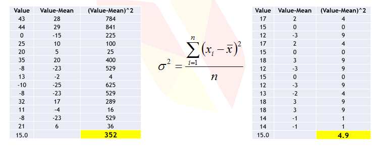
Variance
- Dispersion is the quantification of deviation of each point from the mean value.
- Variance is average of squared distances of each point from the mean value.
- Variance is a fairly good measure of dispersion.
- Variance in profit for company A is 352 and Company B is 4.9.
- Company A is giving high fluctuation in profit whereas company B is giving low fluctuation in profit. So company B is preferred.
- We basically say that, less the variance, less the noice in our data.
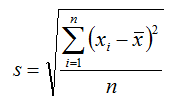
Standard Deviation
- Standard deviation is just the square root of variance
- Variance gives a good idea on dispersion, but it is in the order of squares.
- It’s very clear from the formula that variance units are squared than that of original data.
- Standard deviation is the variance measure that is in the same units as the original data.
Caluclating Variance and Standard Deviation
- Divide the Income data into two sets. USA v/s Others.
- Find the variance of “education.num” in those two sets. Which one has higher variance?
- Variance is calculated using var() function. Code is as given below:
usa_income=Income[Income["native-country"]==' United-States']
usa_income.shape
other_income=Income[Income["native-country"]!=' United-States']
other_income.shape
#Var and SD for USA
var_usa=usa_income["education-num"].var()
var_usa
std_usa=usa_income["education-num"].std()
std_usa
var_other=other_income["education-num"].var()
var_other
std_other=other_income["education-num"].std()
std_other
LAB: Variance and Standard deviation
- Dataset: “./Online Retail Sales Data/Online Retail.csv”
- What is the variance and s.d of “UnitPrice”
- What is the variance and s.d of “Quantity”
- Which one these two variables is consistent?
##var and sd UnitPrice
var_UnitPrice=Online_Retail['UnitPrice'].var()
var_UnitPrice
std_UnitPrice=Online_Retail['UnitPrice'].std()
std_UnitPrice
#variance and sd of Quantity
var_UnitPrice=Online_Retail['Quantity'].var()
var_UnitPrice
std_UnitPrice=Online_Retail['Quantity'].std()
std_UnitPrice
Percentiles & quartiles in python
Percentiles
A percentile (or a centile) is a measure used in statistics indicating the value below which a given percentage of observations in a group of observations fall. For example, the 20th percentile is the value (or score) below which 20% of the observations are found. For a particular variable population can be devided into 100 equal groups according to the distribution of values.
- A student attended an exam along with 1000 others.
- He got 68% marks? How good or bad he performed in the exam?
- What will be his overall rank?
- What will be his rank if there were 100 students overall?
Imagine that there are 1000 students in a class and out of 1000 students, 1 student got 68% marks. Can we say whether he performed good or not? Here we need to perform relative scaling among 1000 student and compare the ranks of 1000 students.
- Lets say with 68 marks, he stood at 910th position. There are 910 students who got less than 68% and only 89 students got more marks than him.
- He is standing at 91 percentile.
- Instead of telling 68 marks, 91% gives a good idea on his performance.
- Percentiles make the data easy to read.
- pth percentile: p percent of observations below it, (100 – p)% above it.
Lets say there is a guy who got 40 marks and his percentile value is 40 which means 80% people are below him. This kind of scaling is used in competitive exam like CAT,GATE etc.
- Marks are 40 but percentile is 80%, what does this mean?
- 80% of CAT exam percentile means 20% of the people are above & 80% are below.
- Percentiles help us in getting an idea on outliers.
- For example the highest income value is 400,000 but 95th percentile is 20,000 only. That means 95% of the values are less than 20,000. So the values near 400,000 are clearly outliers.
Quartiles
In descriptive statistics, the quartiles of a ranked set of data values, are the three points that divide the data set into four equal groups, each comprising a quarter of the data. A quartile is a type of quantile. The first quartile (Q1) is defined as the value between the smallest number and the median of the data set. The second quartile (Q2) is the median of the data. The third quartile (Q3) is the value between the median and the highest value of the data set.
- Percentiles divide the whole population into 100 groups where as quartiles divide the population into 4 groups
- p = 25: First Quartile or Lower quartile (LQ)
- p = 50: second quartile or Median
- p = 75: Third Quartile or Upper quartile (UQ)
Code for Percentiles and Quantiles
Income["capital-gain"].describe()
#Finding the percentile & quantile by using .quantile()
Income['capital-gain'].quantile([0, 0.1, 0.2, 0.3, 0.4, 0.5, 0.6, 0.7, 0.8, 0.9, 1])
Income['capital-loss'].quantile([0, 0.1, 0.2, 0.3,0.4,0.5,0.6,0.7,0.8,0.9,1])
Income['hours-per-week'].quantile([0,0.1,0.2,0.3,0.4,0.5,0.6,0.7,0.8,0.9,0.95,0.98,1])
LAB: percentiles & quartiles in python
- Dataset: “./Bank Marketing/bank_market.csv”
- Get the summary of the balance variable
- Do you suspect any outliers in balance ?
- Get relevant percentiles and see their distribution.
- Are there any outliers present?
- Get the summary of the age variable
- Do you suspect any outliers in age?
- Get relevant percentiles and see their distribution.
- Are there any outliers present?
bank=pd.read_csv("C:UsersADMINDocumentsPython ScriptsPy ProgrammingSession 1DatasetsBank Tele Marketingbank_market.csv",encoding = "ISO-8859-1")
bank.shape
#Get the summary of the balance variable
#we can find the summary of the balance variable by using .describe()
summary_bala=bank["balance"].describe()
summary_bala
#Get relevant percentiles and see their distribution.
bank['balance'].quantile([0, 0.1, 0.2, 0.3, 0.4, 0.5, 0.6, 0.7, 0.8, 0.9, 1])
#Get the summary of the age variable
summary_age=bank['age'].describe()
summary_age
#Get relevant percentiles and see their distribution
bank['age'].quantile([0, 0.1, 0.2, 0.3, 0.4, 0.5, 0.6, 0.7, 0.8, 0.9, 1])
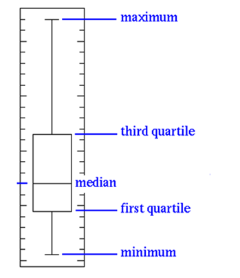
Box plots and outlier detection
The pictorial way to find outliers is called a Box Plot. Box Plots help us in outlier detection. The box plot has a box inside them and therefore they are called box plot. A box plot contains 5 values: minimum value, 1st quartile value or lower quartile (LQ), the median, the 3rd quartile or upper quartile (UQ) and the maximum value. All of these together results in a box plot. The 1st and the 3rd quartile form the box in the box plot. If there are any outliers in the data, the value of the 3rd quartile which covers 75%, will be very small and the maximum value will be far away from the box. If the box in the box plot is very small and if most of it is a line, then definitely there are outliers in the data. Outliers may be plotted as individual points. Box plots are non-parametric: they display variation in samples of a statistical population without making any assumptions of the underlying statistical distribution. The spacing’s between the different parts of the box indicate the degree of dispersion (spread) and skewness in the data, and show outliers. Box plots can be drawn either horizontally or vertically.
- Box plots have box from LQ to UQ, with median marked.
- They portray a five-number graphical summary of the data Minimum, LQ, Median, UQ, Maximum
- Helps us to get an idea on the data distribution
- Helps us to identify the outliers easily
- 25% of the population is below first quartile,
- 75% of the population is below third quartile
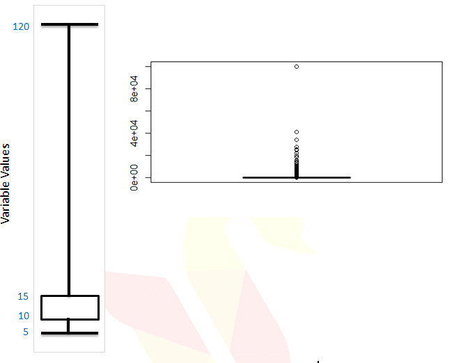
- If the box is pushed to one side and some values are far away from the box then it’s a clear indication of outliers
- Some set of values lies far away from box, which gives us a clear indication of outliers.
- In this example the minimum is 5, maximum is 120, and 75% of the values are less than 15
- Still there are some records reaching 120. Hence it is a clear indication of outliers.
- Sometimes the outliers are so evident, that the box appear to be a horizontal line in box plot.
Box plots and outlier detection on Python
#Do you suspect any outliers in balance
bank=pd.read_csv("C:UsersADMINDocumentsPython ScriptsPy ProgrammingSession 1DatasetsBank Tele Marketingbank_market.csv",encoding = "ISO-8859-1")
import matplotlib.pyplot as plt
%matplotlib inline
#Basic plot of boxplot by importing the matplot.pyplot as plt ("plt.boxplot())
plt.boxplot(bank.balance);
#Get relevant percentiles and see their distribution
bank['balance'].quantile([0, 0.1, 0.2, 0.3, 0.4, 0.5, 0.6, 0.7, 0.8, 0.9,0.95, 1])
#Do you suspect any outliers in balance
# outlier are present in balance variable
#Do you suspect any outliers in age
#detect the ouliers in age variable by plt.boxplot()
plt.boxplot(bank.age);

#Do you suspect any outliers in age
#outliers are not present in age variable
#No outliers are present
#Get relevant percentiles and see their distribution
bank['age'].quantile([0, 0.1, 0.2, 0.3, 0.4, 0.5, 0.6, 0.7, 0.8, 0.9, 0.95,1])
Graphs or Plots
Graphs are diagrams showing relation between variables, quantities or the visual description of a single variable. Graphs and plots are very important in visualization of the data. It gives an idea of how the data is distributed towards a scale.
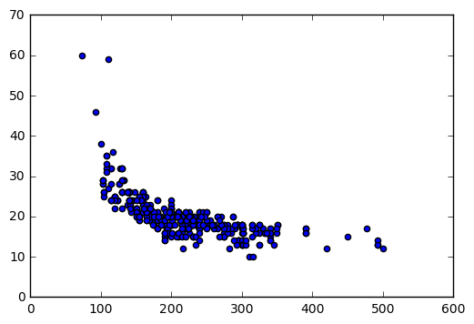
Scatter Plot:
- Scatter Plot:
- Scatter plots give us an indication on the relation between the two chosen variables.
- The two variables has to be numerical.
Code for Scatter Plot:
##Scatter Plot:

cars=pd.read_csv("C:UsersADMINDocumentsPython ScriptsPy ProgrammingSession 1DatasetsCars DataCars.csv",encoding = "ISO-8859-1")
cars.shape
cars.columns.values
cars['Horsepower'].describe()
cars['MPG_City'].describe()
import matplotlib.pyplot as plt
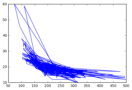
plt.plot(cars.Horsepower,cars.MPG_City)
plt.scatter(cars.Horsepower,cars.MPG_City)
LAB: Creating Graphs:
- Dataset: “./Sporting_goods_sales/Sporting_goods_sales.csv”
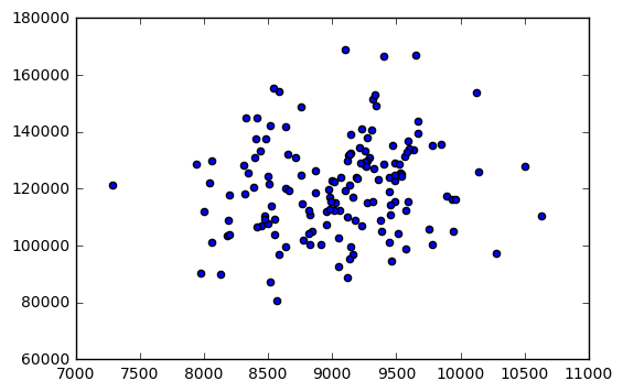
- Draw a scatter plot between Average_Income and Sales. Is there any relation between the two variables?
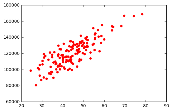
- Draw a scatter plot between Under35_Population_pect and Sales. Is there any relation between the two?
import matplotlib.pyplot as plt
#Sports data
sports_data=pd.read_csv("C:UsersADMINDocumentsPython ScriptsPy ProgrammingSession 1DatasetsSporting_goods_salesSporting_goods_sales.csv")
sports_data.head(10)
#Draw a scatter plot between Average_Income and Sales. Is there any relation between two variables
plt.scatter(sports_data.Average_Income,sports_data.Sales)
#Draw a scatter plot between Under35_Population_pect and Sales. Is there any relation between two
plt.scatter(sports_data.Under35_Population_pect,sports_data.Sales,color="red")
Bar Chart:
• Bar charts are used to summarize the categorical variables and see the frequencies or the count of those variables.
Code for Bar Chart:
In order to plot the Bar chart for categorical variables, first we have to find the frequency distribution of the variable using the function, values_count(). Then we divide the frequency table into values and indexes. The values function tells the distribution of values and index tells about categories. The bar chart is plotted between indexes and values using a function called .bar().
#Bar charts used to summarize the categorical variables

import pandas as pd
cars=pd.read_csv("C:UsersADMINDocumentsPython ScriptsPy ProgrammingSession 1DatasetsCars DataCars.csv",encoding = "ISO-8859-1")
cars.shape
cars.columns.values
freq=cars.Cylinders.value_counts()
freq.values
freq.index
import matplotlib.pyplot as plt
plt.bar(freq.index,freq.values)
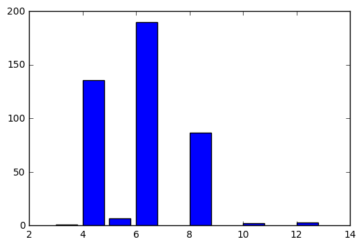
LAB: Bar Chart:
- Dataset: “./Sporting_goods_sales/Sporting_goods_sales.csv”
- Create a bar chart summarizing the information on family size.
sports_data=pd.read_csv("C:UsersADMINDocumentsPython ScriptsPy ProgrammingSession 1DatasetsSporting_goods_salesSporting_goods_sales.csv",encoding = "ISO-8859-1")
sports_data.shape
sports_data.columns.values
freq=sports_data.Avg_family_size.value_counts()
freq.values
freq.index
import matplotlib.pyplot as plt
plt.bar(freq.index,freq.values)
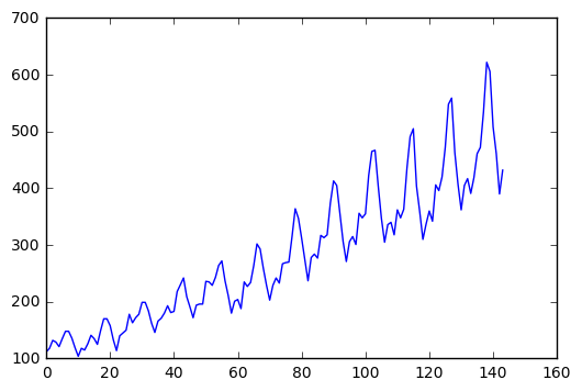
Trend Chart:
- Trend Chart is used for time series datasets.
- It determines the value of the variable in a particular interval of time.
Code for Trend Chart:
We are taking AirPassengers dataset for plotting the trend, chart.Plot() function is used for plotting the trend chart.
AirPassengers=pd.read_csv("C:UsersADMINDocumentsPython ScriptsPy ProgrammingSession 1DatasetsAir Travel DataAir_travel.csv", encoding = "ISO-8859-1")
AirPassengers.head()
AirPassengers.columns.values
import matplotlib.pyplot as plt
plt.plot(AirPassengers.AIR)
Conclusion:
- In this session we discussed some basic data reporting and graph.
- Studying descriptive statistics is essential before we start our advanced modeling. It gives us an idea on the variable distribution.
- We also discussed, drawing graphs using some useful packages in Python.